Geography 370 Assignment 5
Correlation & Spatial Autocorrelation
Part I. Census Tracts & Population in Milwaukee, WI
Part I included population data being given about Milwaukee and using correlation to see if there was comparisons between the data. To do the correlation calculation, the data had to be downloaded from Excel onto SPSS. The matrix can be seen in figure 1. The stronger relationships have a higher correlation value closer to 1 or -1. A positive 1 is equal to a positive relationship, whereas -1 is equal to a negative relationship between the two variable. A correlation value closer to 0 means there is little or no correlation between the two values.
 Figure 1.
Looking at the matrix, there are some patterns that can be seen between the different variables. A few correlations that stands out as being some of the strongest are with the white populations. They have a strong correlation with median household income, retail jobs, and manufacturing jobs. On the other hand, black populations have little to no correlation but are significant with a two-tailed test. Hispanic populations have a small but present correlation with manufacturing jobs, but not with jobs such as finance or retail. These correlations imply that there is a relationship with the variables but do not imply causation.
Part II. Spatial Autocorrelation
Voting data was given from the Texas Election Commission about the 1980 and the 2016 elections in the state. Data was given considering Hispanic populations as well as information regarding democratic votes. The Commission needed an analysis done spatially to see whether there was any correlation or patterns between these variables. Additionally, the graphs and maps can be analyzed as to whether or not there was a change in those potential patterns from 1980 vs 2016. Scatter charts and cluster maps were made to see whether there was a cluster pattern of Hispanic voters and what side of the political spectrum they are at. This was done by first downloading and creating a shapefile for Texas with all the data needed and joined. Data needed to be downloaded from the US Census website was Hispanic populations in each county of Texas. Texas election data looking at each county's political views from 1980 and 2016 was given and just needed to be joined with the shapefile. Then, ArcGIS and GeoDa softwares were used to create Morans I tests and Lisa cluster maps. The Morans charts can tell if there is a clustering of data and give a spatial view as to how clustered that data is. Lisa cluster maps show similar information but presented on a map. It shows the clustering of data in comparison to areas surrounding it.


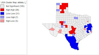
Figure 2.
Figure 2 shows the scattering of voter turnouts in 2016 (top) and voter turnouts in 1980. They both have a positive curve, meaning there is a positive relationship. There is a higher slope on the voter turnout in 1980. Below, figure 3 shows the charts of democratic votes in 2016 (top) vs. 1980. Note that there is a higher slope and relationship in this set of data. There is more clustering in the 2016 democratic votes than in the 1980. There are also visible differences that can be seen in the Lisa maps. The counties around Houston have a high number of democratic voters compared to other parts in the state. Democratic votes can more commonly be seen in the east in 2016. There were more republican votes in 1980 in northern Texas than in 2016.


Part I. Census Tracts & Population in Milwaukee, WI
Part I included population data being given about Milwaukee and using correlation to see if there was comparisons between the data. To do the correlation calculation, the data had to be downloaded from Excel onto SPSS. The matrix can be seen in figure 1. The stronger relationships have a higher correlation value closer to 1 or -1. A positive 1 is equal to a positive relationship, whereas -1 is equal to a negative relationship between the two variable. A correlation value closer to 0 means there is little or no correlation between the two values.

Looking at the matrix, there are some patterns that can be seen between the different variables. A few correlations that stands out as being some of the strongest are with the white populations. They have a strong correlation with median household income, retail jobs, and manufacturing jobs. On the other hand, black populations have little to no correlation but are significant with a two-tailed test. Hispanic populations have a small but present correlation with manufacturing jobs, but not with jobs such as finance or retail. These correlations imply that there is a relationship with the variables but do not imply causation.
Part II. Spatial Autocorrelation
Voting data was given from the Texas Election Commission about the 1980 and the 2016 elections in the state. Data was given considering Hispanic populations as well as information regarding democratic votes. The Commission needed an analysis done spatially to see whether there was any correlation or patterns between these variables. Additionally, the graphs and maps can be analyzed as to whether or not there was a change in those potential patterns from 1980 vs 2016. Scatter charts and cluster maps were made to see whether there was a cluster pattern of Hispanic voters and what side of the political spectrum they are at. This was done by first downloading and creating a shapefile for Texas with all the data needed and joined. Data needed to be downloaded from the US Census website was Hispanic populations in each county of Texas. Texas election data looking at each county's political views from 1980 and 2016 was given and just needed to be joined with the shapefile. Then, ArcGIS and GeoDa softwares were used to create Morans I tests and Lisa cluster maps. The Morans charts can tell if there is a clustering of data and give a spatial view as to how clustered that data is. Lisa cluster maps show similar information but presented on a map. It shows the clustering of data in comparison to areas surrounding it.


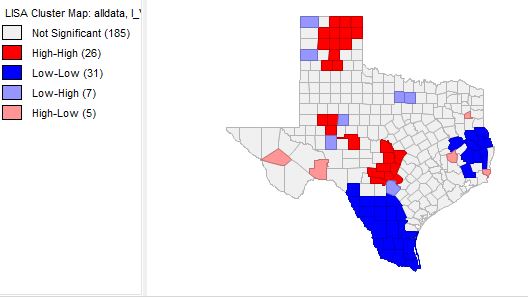
Figure 2 shows the scattering of voter turnouts in 2016 (top) and voter turnouts in 1980. They both have a positive curve, meaning there is a positive relationship. There is a higher slope on the voter turnout in 1980. Below, figure 3 shows the charts of democratic votes in 2016 (top) vs. 1980. Note that there is a higher slope and relationship in this set of data. There is more clustering in the 2016 democratic votes than in the 1980. There are also visible differences that can be seen in the Lisa maps. The counties around Houston have a high number of democratic voters compared to other parts in the state. Democratic votes can more commonly be seen in the east in 2016. There were more republican votes in 1980 in northern Texas than in 2016.


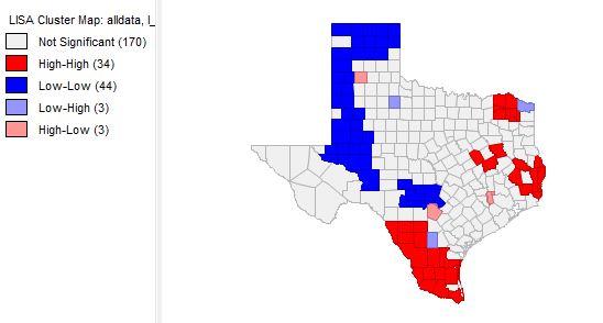
Figure 3.


Comments
Post a Comment