Geog 370 Assignment 1
Part I.
Nominal, Ordinal, Interval, and Ratio Data: What's the difference?
Provide explanations and examples of each.
Nominal Data

Ordinal Data
Ordinal data is information that is compared and ranked with other separate values. A set of priorities is given and the data is thus ranked accordingly. This is a type of data that is dependent on numerical values, but it is the ranking that shows its true importance to the map reader. For example, the map below shows median household income in 2012 at a county level. It is clear to the reader that the darker counties that show a higher median income is ranked higher than the counties with lower.

Interval Data

Ratio Data
Ratio data is the same as interval, yet it does have a real or actual zero that carries meaning along with it. They still have exact values between units and note the order of information. An example of this below is from the US census of bureau that states males of the age 18-24 that are high school graduates. Here the bureau must take into account age and therefore cannot have any information with people below zero years of age.

Part II.
Where should my company target messages to increase farming operated by females?
Using three different classification methods, explain which method should be used and why.
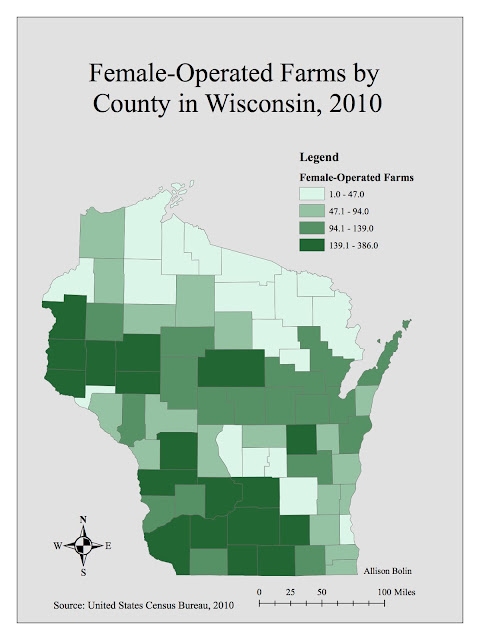
Method one: Quantile
The quantile method contains separate classes where each class has the same number of values. This means that in the map below, there are the same number of counties in each legend category. Because of this, the information presented on the map can often mislead the reader when then data is not linear or broken up unevenly. With only four classes, the map below makes it seem as if there are plenty of farms throughout the state that are operated by females. However, note that the lightly shaded counties could be counties with 386 farms or with 139 farms, a stark difference when we are attempting to show the amount of farms on the lower side of this value. For this reason, I would not choose this map to represent to the company.


Nominal, Ordinal, Interval, and Ratio Data: What's the difference?
Provide explanations and examples of each.
Nominal Data
Nominal data is arguably the easiest and most basic type of data to use. In short, when making a map, nominal data are different features or numbers that provide a basic understanding to the information being presented. Nominal data is individual without any ranking or order associated with it. Below is a screenshot taken from Google Maps of the town that I am from, Cedarburg. Every road name, pond or park label represents an example of nominal data. Each name is different and distinct without one being better or higher up than the other.

Ordinal Data
Ordinal data is information that is compared and ranked with other separate values. A set of priorities is given and the data is thus ranked accordingly. This is a type of data that is dependent on numerical values, but it is the ranking that shows its true importance to the map reader. For example, the map below shows median household income in 2012 at a county level. It is clear to the reader that the darker counties that show a higher median income is ranked higher than the counties with lower.

Interval Data
Interval data, similarly to ordinal data, is ranked but not ranked in order of importance or pleasing. Each interval category is equally split up and not one is better than the other. The difference between each value will always be the same. An important concept to remember in interval data is that there is no "true zero." This means that the numbers could go below zero or above and still be considered justified and true. An example below showing interval data is an elevation map showing the highs and lows of California from J.S. Salonen. Note that in the legend, the numbers can go above and below zero.

Ratio Data
Ratio data is the same as interval, yet it does have a real or actual zero that carries meaning along with it. They still have exact values between units and note the order of information. An example of this below is from the US census of bureau that states males of the age 18-24 that are high school graduates. Here the bureau must take into account age and therefore cannot have any information with people below zero years of age.

Part II.
Where should my company target messages to increase farming operated by females?
Using three different classification methods, explain which method should be used and why.
Method one: Quantile
The quantile method contains separate classes where each class has the same number of values. This means that in the map below, there are the same number of counties in each legend category. Because of this, the information presented on the map can often mislead the reader when then data is not linear or broken up unevenly. With only four classes, the map below makes it seem as if there are plenty of farms throughout the state that are operated by females. However, note that the lightly shaded counties could be counties with 386 farms or with 139 farms, a stark difference when we are attempting to show the amount of farms on the lower side of this value. For this reason, I would not choose this map to represent to the company.

Method two: Equal Interval
The equal interval method is different from the quantile method because instead of having the same number of values in each category or class, it divides each range values evenly into each class. In the map below, there are four classes and each represent a range of 96. Though this gives a slightly more neutral look as to how many farms are in each county, the fact is is that this is an equally distribution map showing unequally distributed information. Therefore, it misrepresents the information we are trying to show and does not fit what we are trying to achieve as a company.

THE WINNER
Method three: Natural Breaks (Jenks)
The natural breaks method is a method used to classify values into the points where it makes natural breaks within the distribution. It seeks to minimize the variance within each category or class of the data while making the differences between groups different and recognizable. When using data similar to the information used in this map that has a high variance, it typically provides the most accurate representation of trends within the information. Because of this, I would provide the map below to the company to most accurately portray the places to focus on to encourage more female operators of farms.


Comments
Post a Comment